Cashture — Finance Dashboard Design Case Study
Clarity in every number.
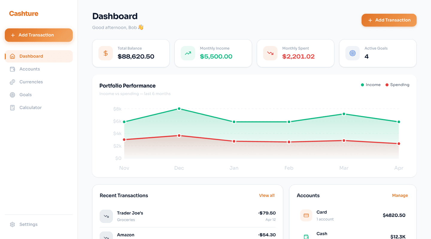
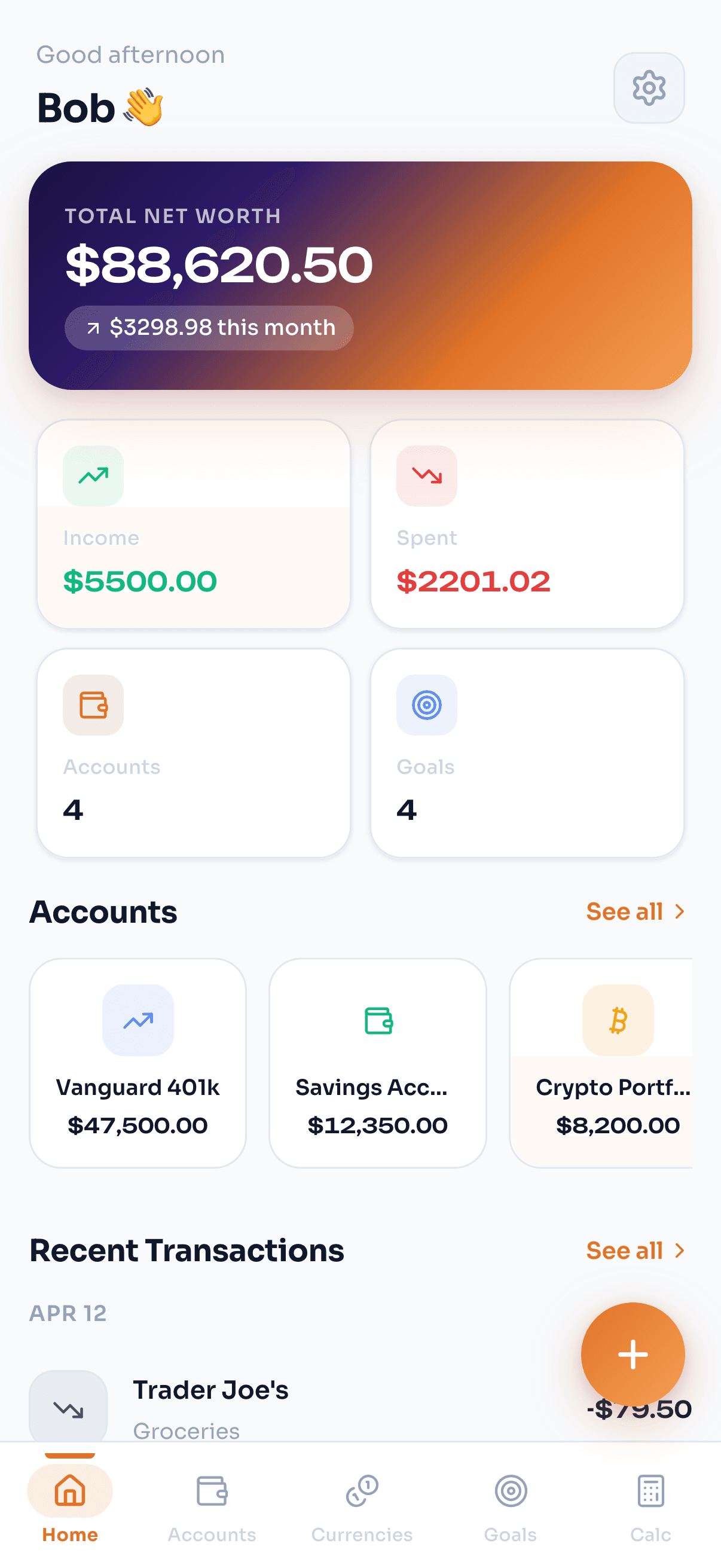
Cashture is a personal finance dashboard designed around one principle: your money should be easy to understand at a glance. Portfolio performance, transactions, budgets, and multi-currency support — unified in a single clean interface.
Finance, without the noise
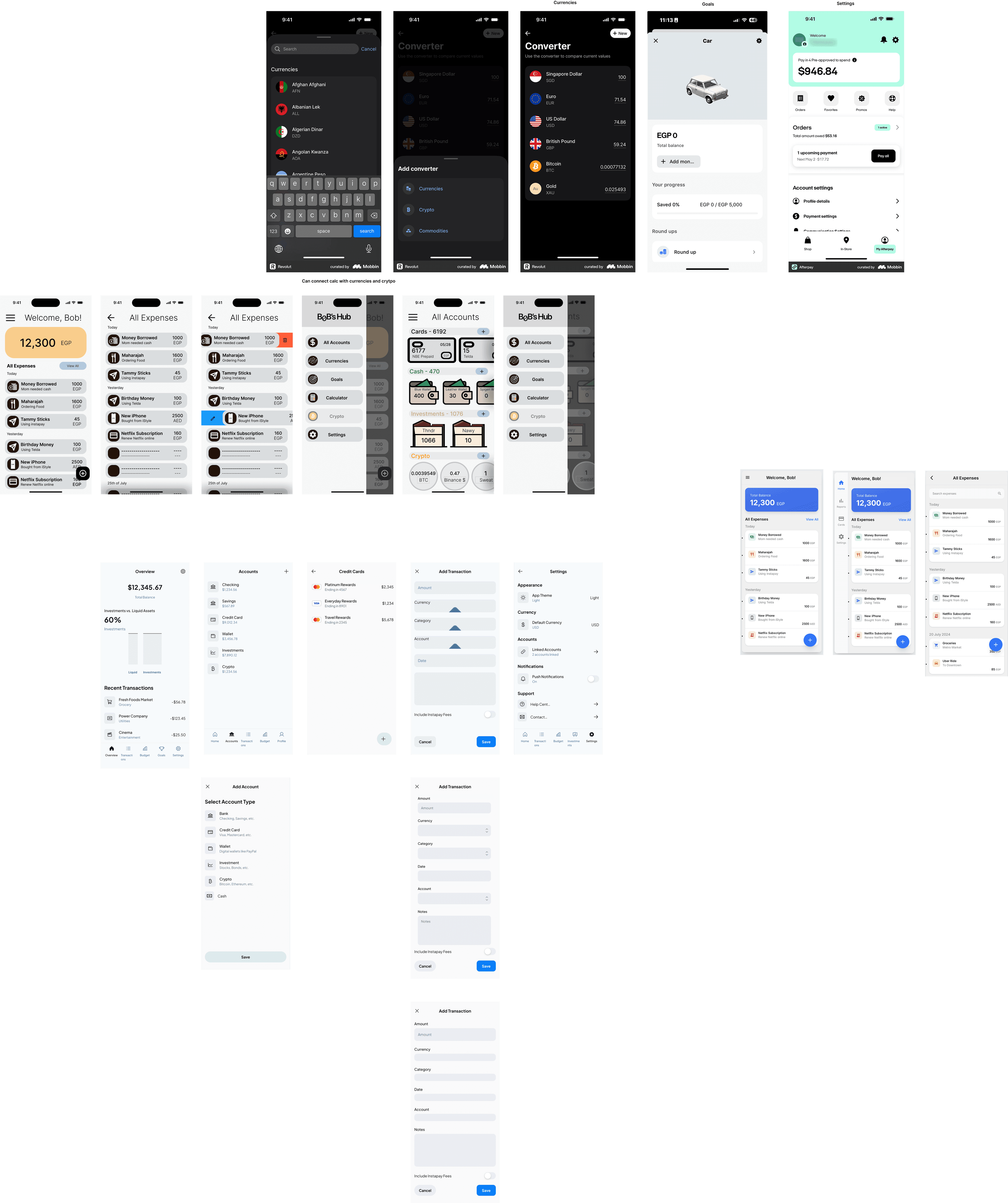
Most finance apps overwhelm users with numbers. Cashture was designed around the opposite principle: surface what matters, hide what doesn't. Every data point earns its place on the screen.
The goal was a dashboard that a user could glance at in 10 seconds and know exactly where they stand — without training, without documentation, without friction.
Data hierarchy first
We established a clear visual hierarchy: the portfolio summary at the top, transactions and budgets below, with charts providing context rather than dominating the view. Typography and whitespace do the heavy lifting.
Multi-currency support was built into the architecture from day one — not bolted on. The result is a dashboard that feels equally at home whether you're tracking EGP, USD, or EUR.
Dashboard UI
Full dashboard layout with widgets, charts, and data hierarchy built for scannability.
Transaction Views
Transaction history, categories, and filters — clarity at every level.
Portfolio Tracking
Performance charts and portfolio breakdown with multi-currency support.
Instant Interactions
Fully client-side — every action responds instantly, no loading states.
Brand Identity
Logo & Mark
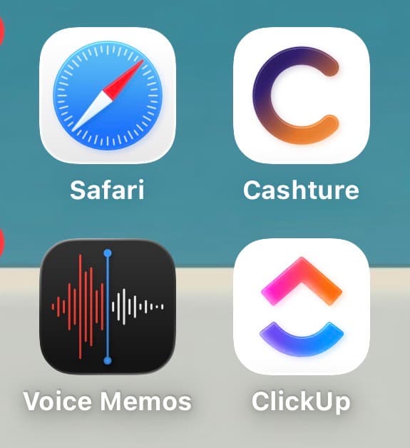
Designed the Cashture wordmark and icon — built for clarity at any size.

Need a product designed?
Your product.
Next.
We design web apps and dashboards with the same clarity — clean, functional, built to perform.